A subscription that worked across 20+ of Bukalapak's digital tools for small store owners, and a new premium brand, plus+, to carry it. I led the design end to end, from the checkout flow to the brand name and color.
Flexible enough to scale, but simple enough for every team's needs.
That cycle, Bukalapak's company goals centered on revenue. One of the bets, backed by research, was a subscription model: people told us they were willing to pay for a program from us, as long as it gave them more back. The Mitra platform serves millions of small store owners across Indonesia who already leaned on a wide range of our digital tools, so a paid tier had somewhere real to live.
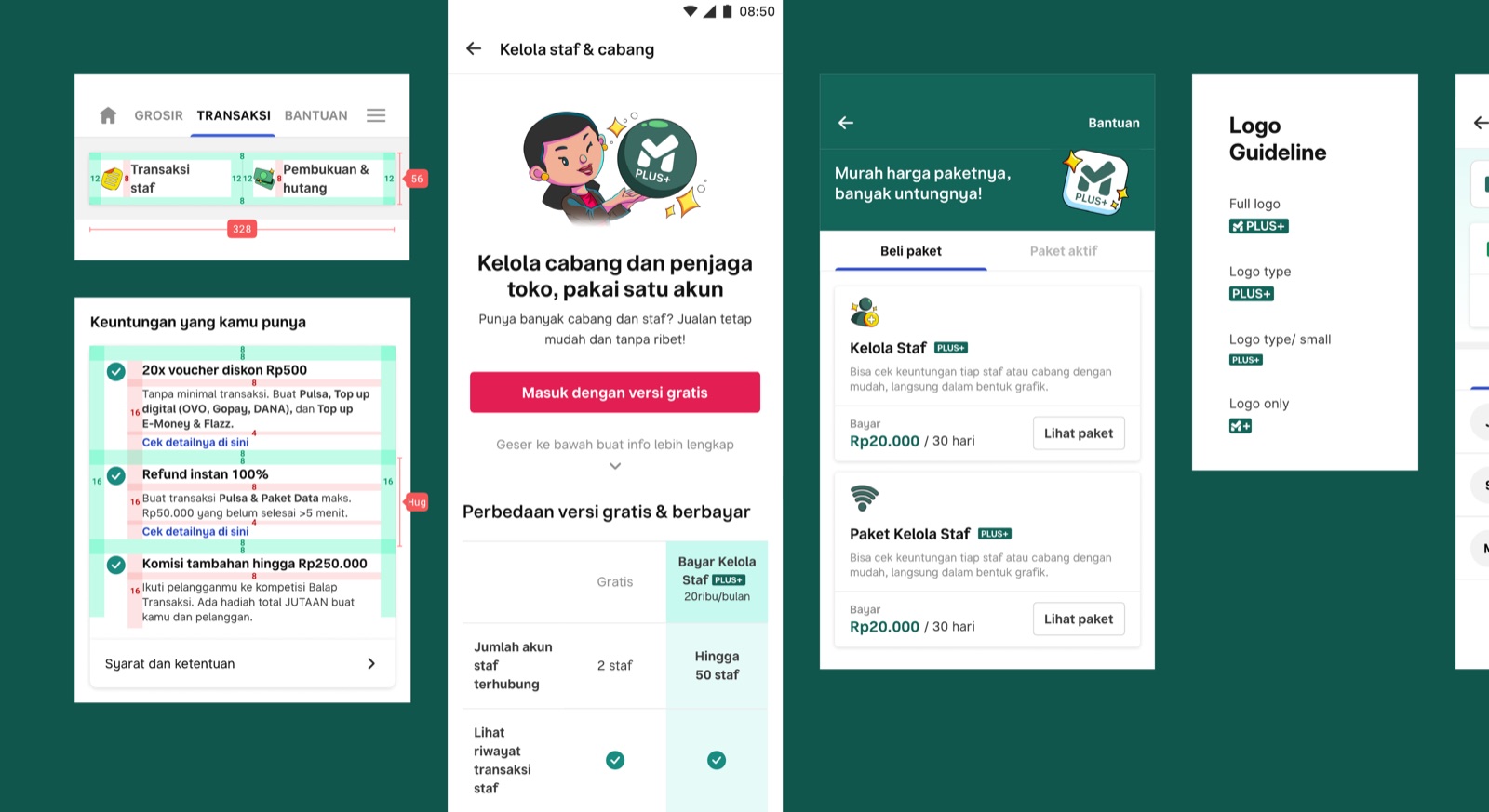
One product area needed a scalable way to offer premium features across 20+ digital tools. I was asked to design a single subscription experience that could work across all of them, align with the business goals, and stay flexible enough to keep growing. Three goals framed the work:
- One centralized experience that worked across 20+ products, not a separate paywall per tool.
- Stakeholder buy-in: align the core team on one vision while genuinely addressing other teams' needs and concerns.
- A brand that fit both business and users, built from nothing, since it didn't exist yet.
I led the design as the project's design lead, working at both the strategic and hands-on level, from UI to branding:
- Drove the effort to define the brand name and color.
- Facilitated collaboration across divisions to keep brand, business, and user needs aligned.
- Led discussions with engineering so the product would stay scalable.
My collaboration model was simple to say and harder to do: Informed, Involved, Engaged. Match the method to each stakeholder's level of involvement. The people closest to the work needed a safe space to co-create and brainstorm; everyone else needed to be kept clearly informed so no one was surprised later.
The product challenge sat underneath all of it. Two teams arrived with two different revenue models, a VP (PPOB) bundling approach and a Mitra branching system on a freemium model. The design had to reconcile both into one centralized checkout that still met each team's specific needs.
I mapped the experience as four moments: discovery (finding the subscription on a landing or product page), learning (understanding the features and benefits), purchase, and the post-purchase life of expiration, recurrence, and reminders.
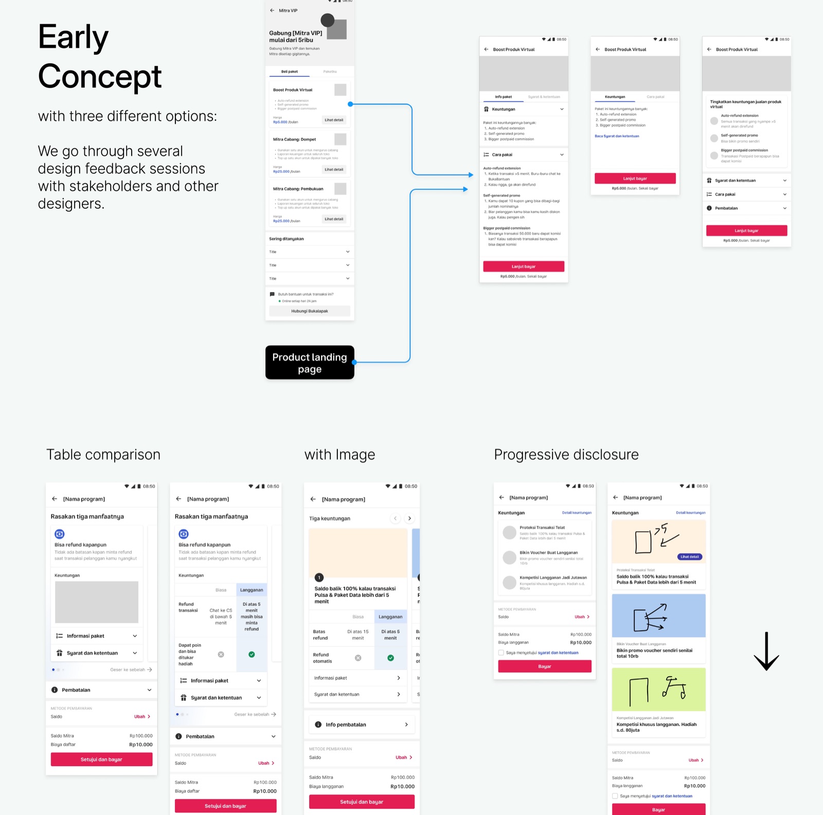
Early on we explored three concepts, from a table comparison with progressive disclosure, to a simpler page with the call to action brought closer, to a more visual version. After several feedback sessions with stakeholders and designers we were, honestly, overwhelmed by options, and came back to exactly where we started: one centralized checkout, flexible enough to scale, simple enough for every business. We then pressure-tested that direction with A/B user tests across the landing, checkout, payment, recurrence, and expiration flows.
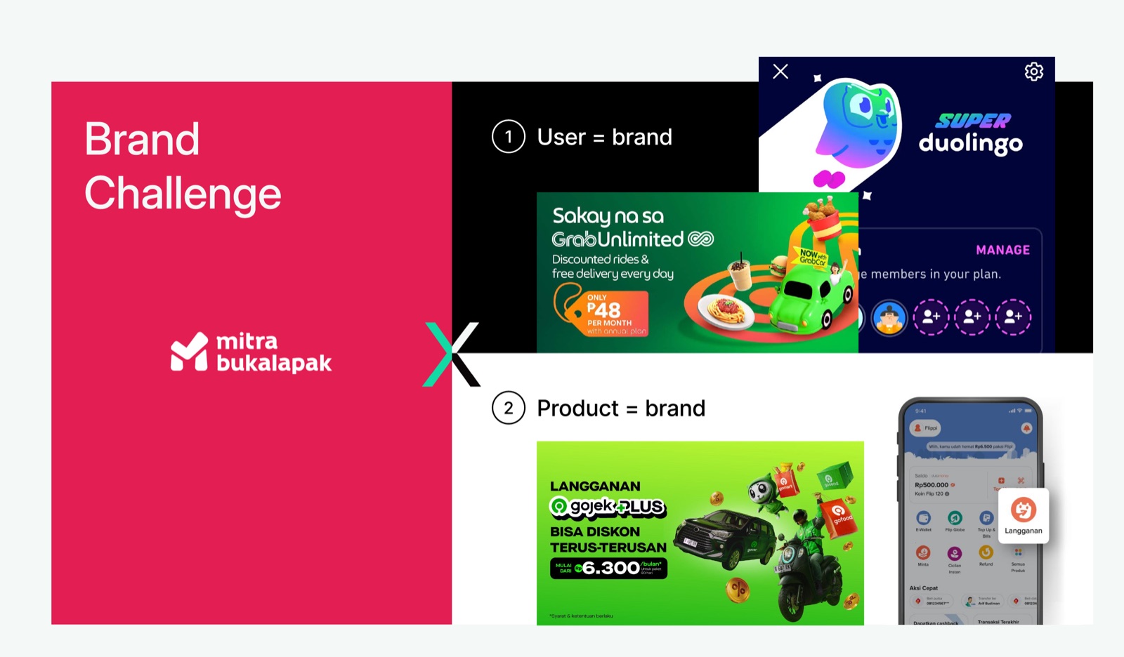
The brand didn't exist yet, and the team was split on what it should anchor to: the user, or the product. Designers are good at making the abstract concrete, so I built "what if" scenarios and concrete naming and packaging recommendations to give everyone something real to react to. That became plus+, the premium brand, priced at Rp20,000 a month and applied across the tools (for example, Kelola Staf plus+).
The work shipped as one centralized subscription experience and a new premium brand now used by millions of store owners every month. It added $16K in monthly revenue, and left behind a shared, scalable definition of "premium" the teams kept building on. The real unlock wasn't a lower price or a bigger bundle: it was finding the gap between free and paid that each segment would obviously say yes to. Cheap isn't the lever; undeniable value per segment is.